
Heatmap
You can use heat maps to determine the regional densification of data values. This process is also known as clustering. The densities will display on the map in mountain-like form or as hot zones.
The Heatmap analysis is particularly suitable for evaluating available locations as well as positioning new ones. Using the potential as a reference, then areas with particularly high cumulated data values (such as hot zones or mountain peaks) result as ideal locations.

Variants
In the site-specific variant of the heat maps, the map is displayed similarly to the images from thermal imaging cameras: Data peaks appear as especially "hot zones". In the area-related variant of the heat maps, the data peaks appear like mountains.
With the variant Heatmap, area-related - in contrast to the analysis Area coloration - each building block is evaluated not only with its own data, but also with the data of the building blocks in its environment. You can specify up to which distance the data of the building blocks in the environment should be considered and to which extent the data should be included with increasing distance. The areas of the blocks are colored based on the calculated evaluation according to color classes.
The option Heatmap, location based resolves even more detailed than the area based option of the heatmap. In this case, the entire map area is split into pixels and not only every building block, but every pixel is evaluated with the surrounding data. You can specify up to which distance the surrounding data should be taken into account and to what extent the data should be included in the calculation with increasing distance. The pixels' color is classified on the basis of the calculated values. This results in a much finer image resolution than the area based variant, as it does not result in color cracks at a building block boundary. The colour transitions are fluid, the border contours blur. Pay attention:
- Because of the pixelation, the calculation of a location based heatmap is considerably more complex.
- The resulting data value for a certain pixel is difficult to understand from the basic data. It is recommended to activate the Tooltip for analysis. Then EasyMap displays the cumulated data value for the mouse position when the mouse is moved over the map.
- As for any analysis, the underlying data table is linked to the map for a location based heatmap. However, since each data row is also included in the evaluation of the perimeter, EasyMap marks a circular area in the map after clicking into the table and thus indicates the area included in the calculation of the value. Clicking on the map does not, however, mark rows in the table. This is not possible due to ambiguous assignments and performance reasons.
Creating a New Analysis
From the Data control window, you can Drag&Drop the data column for the Heatmap onto the map. After defining the method of analysis and assignment level, select the Analysis type, such as Area-based or Location-based, as well. For more on this, please see Variants and Selection of Data Basis.
Note: You can also insert your analysis via the menu bar Analyze. You get an analysis without predefined settings and value classes.
- What does assignment result?
- Would you like to place your data on the map using geographical coordinates? So the The Data Input for an Analysis.
- Via the Advanced button you can specify whether the analysis should consider an existing clip maps in the calculation of classifications - more about Analysis reference.
Set the Properties of the Heatmap
Properties refers to all settings for calculating and displaying the analysis. You can select or change certain columns of the previously defined table to control certain aspects of the display (e.g. the color). You can also access this settings dialog if you want to edit existing analyses.
If you have inserted the analysis via the main menu, the Heatmap is initially inserted after the Number of records (see Data column).
Selection of the data column
First select the column to be evaluated.
- With a area-related analysis you can additionally determine aggregation of the data of the selected column. This specifies the rule how data are combined if several data are available for an area.
-
The Format option is only available for area-specific analyses. Normally, the formatting of the selected data column is also used for the analysis result; this is always the case for site-specific analyses. For certain aggregation procedures (for example, number of values), however, this formatting cannot be used meaningfully. You can define a new formatting here, which is used in legends for this analysis, for example.
- Under Statistics you can display statistical information (e.g. number of data records, min., max.) for the selected column - click on the button in the field next to Statistics.
In the first section Color there are two display types available: Classified and Continuous. By default, a continuous color gradient of the heatmap is preselected, but you can edit it at any time. The properties are the same here, regardless of the type of analysis you have chosen - location-based or area-based.
How should the data be handled with increasing distance?
Before the analysis is displayed, a cumulated value is calculated for each area or pixel, which is then displayed as area shading.
This value results as sum of the base values of all areas in a certain circle (defined by the radius). Areas closer to this area are often more relevant than areas further away. Therefore, you can additionally specify whether the values of other areas should be weighted with the distance .
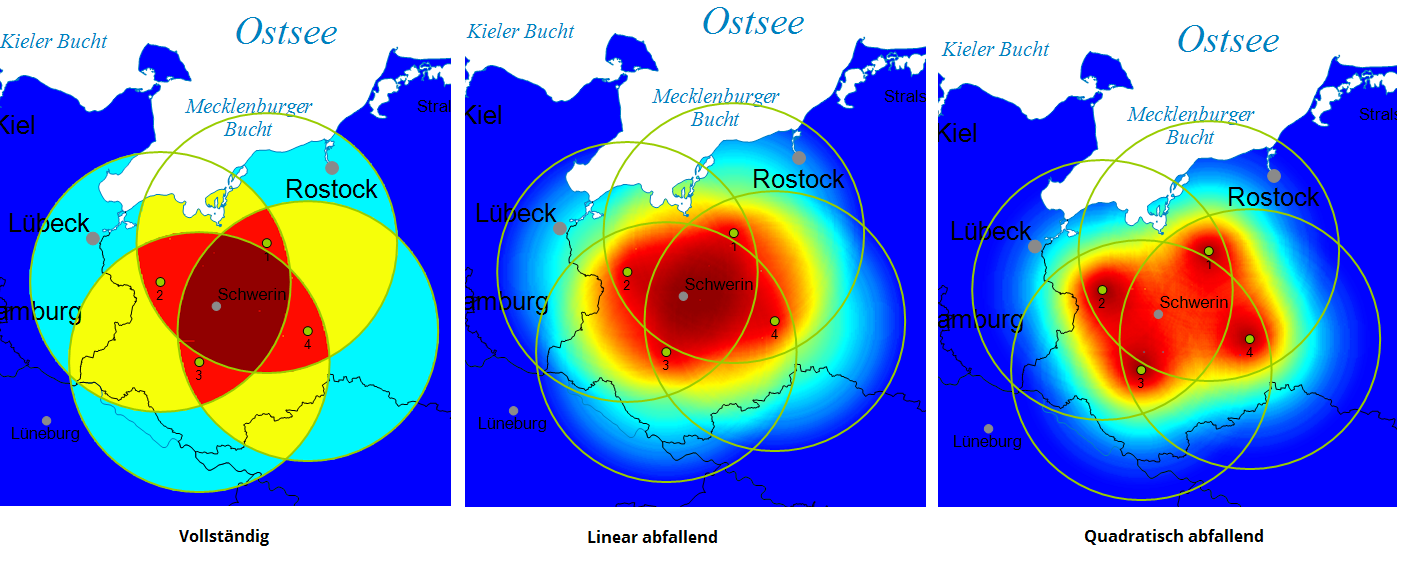
The following methods for taking into account the distance are offered: Complete, Linear descending or Square descending.
The following figure shows a comparison of the three options for a location based heatmap. A radius of 50 km was set; the selected value is the same for each location. With the complete option, the value for the coloring of the 50 km radius is completely included in the calculation. If two circles overlap, both values are completely included in the calculation. The option linear descending calculates the values of a location with increasing distance linearly descending as well as with the third option quadratic descending. As a result, the "hot zones" in the quadratically decreasing heat map are smaller or more sharply defined, since the values decrease faster with increasing distance to the location.
Special effect
If you define the circle from which data are to be included in the calculation of the cumulated data values via kilometer in the map, the same environment is always taken into account for each pixel or for each brick regardless of the zoom. If, on the other hand, you define the circumference over centimeter on the leaf, the circumference to be taken into account changes depending on the zoom, because zooming changes the scale; as a result, the circumference to be taken into account becomes smaller and smaller as the zoom increases for given leaf centimeters. This often leads to a large cluster dissolving into many small sub-clusters as the zoom increases. In the heat map above, this would lead to the Rhine/Ruhr conurbation disintegrating into individual data peaks at the major cities of Cologne, Düsseldorf, Duisburg, Essen, Dortmund, etc.
How should colors and values be classified?
You can choose between a classified or continuous colored heatmap. The option Continuous offers you the convenience of a color gradient without specifying value classes.
In the section Classes, specify the Count of classes and the method of automatic Classification or set User-defined to edit your own classes. In addition to the Analysis area, you may specify the intervals for which the values should be taken into account. Values outside the intervals always fall into the remaining class "Not classified".
In the lower part you can determine the details of the analysis (class list). You may edit the Value Classes and Colors here.
- The design characteristics and class boundaries can be edited by double-clicking in the relevant cell. For example, you can select the color individually by double-clicking on the color of the class.
- for further information on editing value classes, symbols, colors and sizes, see here.
Note: By sorting according to the name of the class, you can force a certain order in the legend!
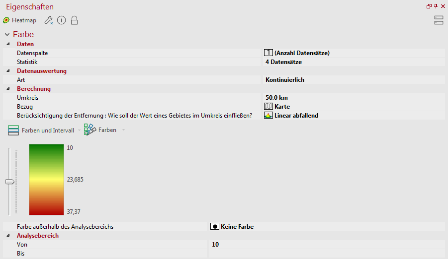
As with the classified option, you can limit the analysis area or define a color gradient, or define color outside of the analysis area.
Use the slider to the left of the color gradient to change the color gradient. This allows the color ranges to be increased or decreased over the entire data range. Check Colors for further editing options and Colors and Interval for saving and loading color gradients.
Determine the details of the analysis
In Details you define other (non-data-dependent) properties of the analysis.
| Visibility | |
| General |
Here you can control the visibility of objects and elements. |
| Scale range |
Here you can set whether the selected object or plane should be visible at each scale. Or you can specify the scale or zoom level at which the object or layer is visible. |
| In reports |
In Reports there is the possibility to change the environment only partially to zeigen. You can use this property to specify whether the layer is also visible outside the report area in this case. |
| Size adjustment |
Specify here how the size of a symbol or diagram behaves when the map scale is changed. This can change e.g. after zoom within the map, after setting a clip map or within a report, because only a part of the map is displayed. More about Size adjustment at auto zoom. |
| Alternating visibility group |
Set a group for mutual visibility here. If the element is to be made equally visible with other elements, you must use the same name for the visibility group. |
| Simultaneous visibility group |
Set a group for simultaneous visibility here. If the element is to be made mutually visible with other elements, you must use the same name for the visibility group. |
| Style | |
| Type of Shading |
Perimeter only The map is colored only in the area of the perimeter defined in the color section. Entire map he entire map is colored. Areas outside the perimeter are colored in the color that represents the value 0 in the color scale or the color outside the analysis area. |
| Boundary |
Select whether the map should be colored No Limit or up to the External Boundary of the area levels. The No Limit option colors the entire sheet. However, the type of shading plays an additional role. |
| Common | |
| Comment | Enter here a comment for the display of the workbook in EasyMap Xplorer. The comment is also displayed in EasyMap as a tooltip in the control window Contents. |
Create tooltips for analysis
When crossing the colored areas on the map, you can display context-sensitive information about them.
Note: You can find out how to implement tooltips here.
The commands of the context menu
By right-clicking on the analysis in the Content control window you may open its context menu. The context menu provides commands that may be performed on this analysis.
| Transfer Selection to |
Transfers the current selection geographically to another object. Details... |
| Visible |
Shows whether the object is visible and allows switching the visibility. |
| Order |
Here you can change the selected element in the character sequence. Another option is to drag and drop the selected element within the content view. |
| Input Data... |
Displays the data settings for the selected analysis. You can use this command later to change the connection between the analysis and the data. Further information can be found here. |
| Show Results Table | Displays the results of the selected analysis in a table. |
| Ignore filter |
Defines whether an Analysis filter should be considered or not. |
| Clip Map |
Here you can define a different clip map for the analysis. |
| Map XY |
Here you will find various commands for the Map. |
| Copy |
Copy the object (if necessary with all subobjects) to the clipboard to paste it elsewhere. The object can be inserted in other applications as a graphic, or inserted in EasyMap as a copy of this object using the Insert command. |
| Paste |
Pastes the contents of the clipboard into this object as a child object. |
| Delete | Deletes the selected element. (See also: delete objects) |
|
Rename |
Changes the content view to an edit mode to give the object a new name. (This can also be achieved by clicking on an object that has already been marked.) |
| Properties... |
Opens a properties dialog in which you can edit the Properties of the selected object. If several objects are selected, many properties can also be changed simultaneously for these objects. |
